Lead Ux
Responsibilities:
My Role Was the Lead UX Ui designer. I was responsible for qualitative research, workflows, ux, wireframes and prototyping.
Tools:
Sketch, InVision
Tools:
Sketch, InVision
Team:
7 people (1 Lead UX, 1 Ui Designer, 1 Product Manager, 1 Business Analyst, 3 Developers)
PROJECT SUMMARY:
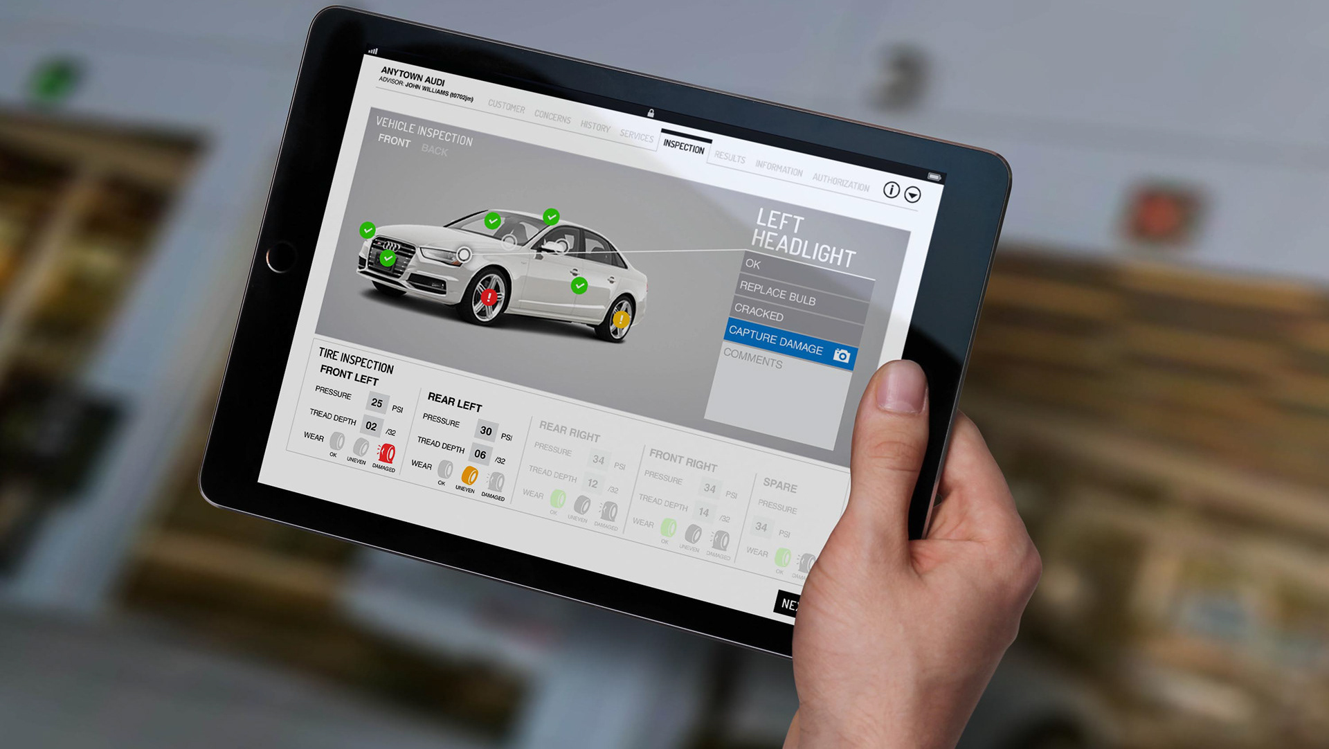
Over the course of 5 weeks, a talented group of 4 and I went through an extensive UX process to generate research, wireframeS, and present a web responsive application for customers and service consultants to communicate information about a customer vehicle's maintenance work, THEIR concerns and any new vehicle repairs that have come up after a multipoint inspection ALONG with pricing and when their vehicle will be ready for pick up. THE CUSTOMER ALSO HAD THE OPTION TO PAY ONLINE AS WELL.
CHALLENGE
We aim to address the disconnection between Customers and Service Advisors along with other 3 problems: a lack of space for customers to provide a response to the service advisor on the repair, a lack of tools for Service Advisors to let the customers have full transparency by tracking progress of their vehicle and most importantly a lack transparency throughout the whole process.
Research
We observed and interviewed customers in dealerships and asked them what their pain points about coming to a dealership were. We found that communication, transparency was nowhere to be found. Customers thought they were being ripped off or forced to buy things they did not need. Pricing was a main frustration as the details were not clear as to why do I need this now.
SOLUTION
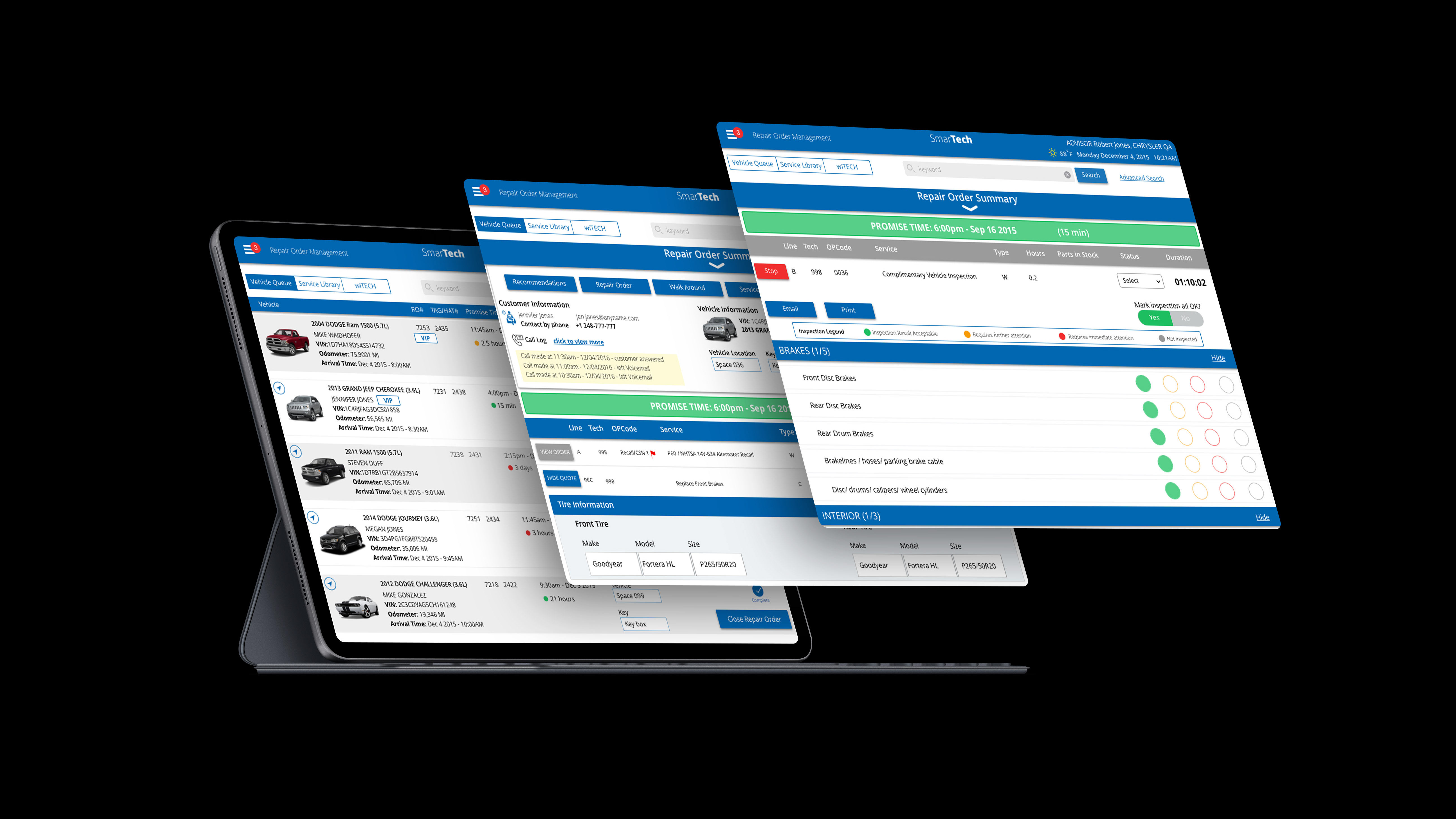
The solution that we have designed is a web responsive application for customers and service consultants to communicate concerns ,vehicle information and maintenance work and any additional work that is needed post inspection and get the customer's approval before a repair with costs and timing and when the vehicle will be ready for pick up and payment online. This solution is very simple, lightweight and designed with customers and SAs' busy lives in mind. For the customer, it is to simply approve maintenance being done pre-inspection and to approve any additional work needed post inspection and giving the customer a length of time when the vehicle is ready and they have the option to pay online or on pick up. For SAs, the application will help them contextualize any new repairs and address any of the customers' concerns. SA's are able to give the customer a delightful user experience and show full transparency without having a customer come back and forth to the dealership, avoid long frustrated phone conversations tying up resources etc.
Design
At the beginning of the design process we created workflows and wireframes for visual purposes. We had a list of screens to cover all scenarios and then we started to detail them into high fidelity screens.
DMPIv2 LOFi Wireframes
DMPI WORKFLOW v1
Project Learnings
1. Keep iterating and validating the ideas before launching any features
2. Define proper measurements for success is one of the keys to validate the users and working closely with data analytics
Next steps for this project was to iterate the process, check the data from new design, find out the pain points and next steps to make the product even better!
2. Define proper measurements for success is one of the keys to validate the users and working closely with data analytics
Next steps for this project was to iterate the process, check the data from new design, find out the pain points and next steps to make the product even better!
